It's All in the Design: The Design behind "It's All Good (Unless It's Not)"
Posted: Tuesday, November 10, 2020
This blog post is part of the University Press Week Blog Tour, highlighting the theme "Creative Voices" We chat with Gerilee McBride, our Catalogues and Advertising Manager, to find out what went into the unique and fun design of It's All Good (Unless It's Not). Read the rest of the "Creative Voices" blog posts here.
It’s All Good looks a little different from most UBC Press books. What inspired the new design?
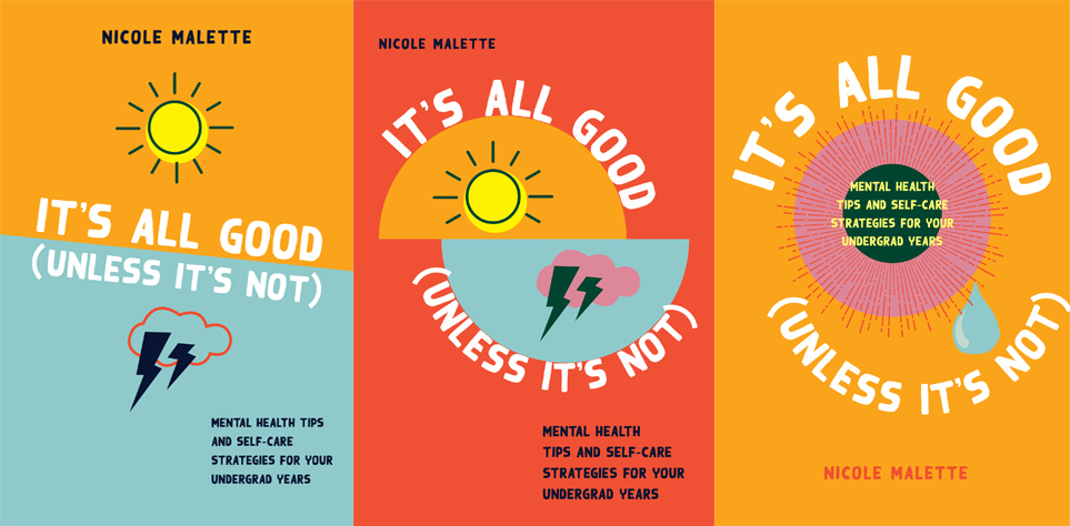
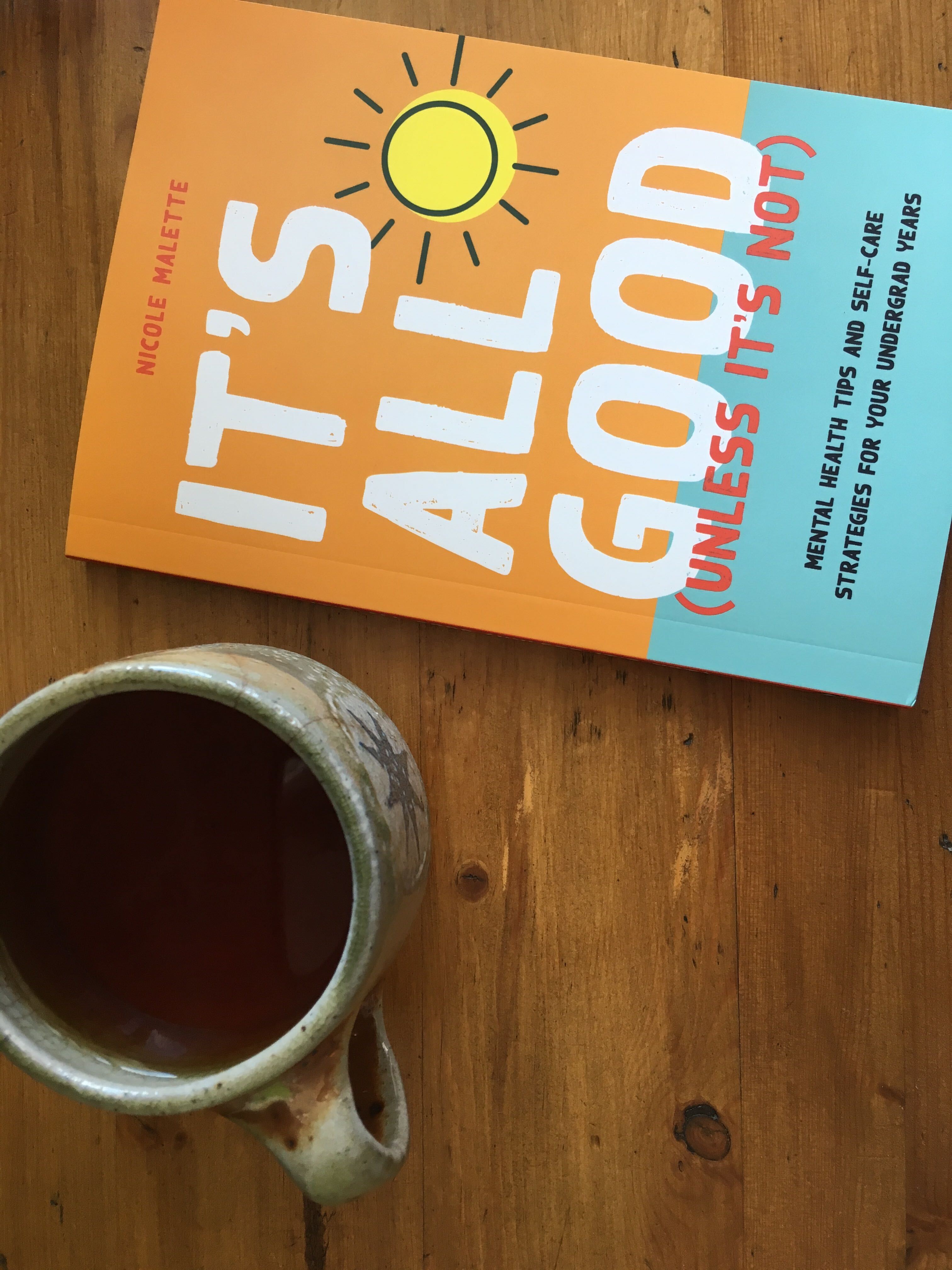
It’s All Good is published under our “On Campus” imprint which features books that help students navigate their university and college careers. Since the primary audience is post-secondary students, I had more leeway to create concepts that have a pop culture feel to them. I wanted to create something that had a big visual impact using a simple design and bright colours. In my first drafts I created a series of emoji-type symbols to explore the dichotomy of a happy/sad relationship using a sunshine and thundercloud. In the end we wanted a more positive feeling cover and so the thundercloud was replaced entirely by the sunshine symbol. I was able to retain some of the emotional ambivalence in the cover by bisecting the page in two colours (orange on top, blue on the bottom) and setting the subtitle in the blue section. In this way I hoped to convey a feeling of maybe things aren’t always okay and you need to look beneath the surface to see what’s really happening.
Is it challenging designing a book with call-outs and other unique features?
It can be, depending on how many elements there are that need a unique design. This book in particular has six different features (Quick Tips, Quick Facts, Student Stories, Self-Care Strategies, FYIs and Getting Help) that needed six different visual styles. The visual styles need to work together to create a cohesive design but they also need to be distinct enough to stand on their own. I used a series of circles and rounded rectangles to achieve this. And then it was a matter of making sure that the features can be easily spotted from any section in the book. For example, the “Getting Help” sidebars are always located in their own column on the outside edges of the pages, so not only are they visually distinct in design but they’re also recognizable because of their repeated location on the pages.
It’s All Good is not only a print book, but an open access PDF. Did this influence your design choices?
Absolutely! I actually started with a full-colour palette for the interior knowing we would produce the PDF as a full-colour book. The greys you see in the print copy of the book are actually shades of the colours from the PDF.
When you approach designing a book’s cover, what tends to inspire you the most?
I’m always looking at and getting ideas from cultural artifacts – from fashion trends to gig posters to modern art. The things I see in everyday life inform my design practice and influence new ways of seeing.

Do you prefer lots of direction from the author and production team, or is it easier if you’re given more creative freedom?
I like to know what likes and/or dislikes the author has at the outset. If they really hate the colour green, for example, then I would take that out of the palette of possibilities at the outset. A book cover is a very personal thing and I can’t think of anything worse than an author detesting their book cover. I find it’s a balance of having just enough information to inform the design without too much pointed direction so that I can come up with some solutions that are a little bit outside the design brief. It’s always easier to go big and bold at the outset and to wrangle it into a tight design than it is to start small and restrained and try to work up to something interesting. A designer is there to show you what the possibilities are and offer a point of view. Having said all that, the production team at UBC Press is fantastic and I was lucky to work closely with one of the production editors, Ann Macklem, to help guide me through the UBCP process and give me valuable feedback from both herself and Nicole.
